|
|
|
Universal Forms
|
|
|
Basic description of forms
|
|
|
Universal Forms Settings
The user can set the Universal forms directly from the main IS K2 area. By means of the icon  show the menu, where set the universal forms for the user via Interface settings - Prefer universal forms option.
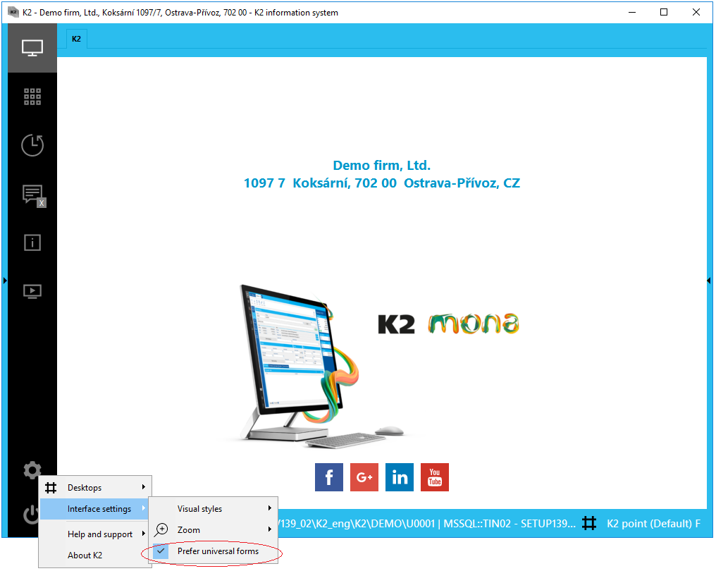
Picture: Universal Forms User Settings
If the Prefer universal forms option is checked the books that support this design will be displayed using these Universal Forms.
The other way how to set this display is by using the User Parameters, where you can find the Other tab after pressing the Other options button on the page 5. Environment. There is also available the Prefer universal forms parameter. This option is automatically checked if universal forms are set by using the option from the IS K2 desktop.
|
|
|
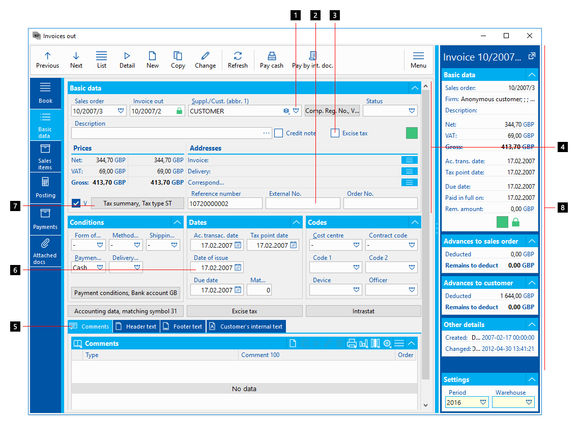
The Basic Structure of a Form
The functionalities and rules of classic and universal forms are mostly similar. Universal forms are enriched with functionality that could not be further developed in classic forms.
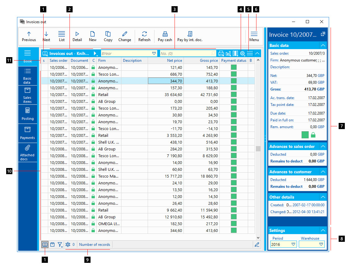
Picture: Book - universal
- Information on a Form Status - information on the page 0 can be displayed using 3 statuses - Book, Container and Filter.
- Information on Current Book and Status - in this case, you can see information from the book 10: Inland.
- Search field (Locator) - a field that allows you to quickly search for the desired item in the book.
- Names of Selected Columns with Information on Book Items - e.g. an invoice order number, a sales order number to which the invoice relates, a customer name, a description - i.e. an optional additional text, the amount for which the invoice is issued and so called flags - letters that inform whether the invoice is confirmed, settled or posted.
- List Menu - this menu contains all the operations related to the displayed list (table).
- Module Menu - it is possible to activate functions related to the appropriate data module through a module menu.
- Quick Record Preview - this panel displays the basic information on the record on which the light indicator is currently set.
- Settings - a book settings can also be a part of the record preview. There may be, e.g. the Business Year in which the documents will be created and the Warehouse. The fields structure of the settings varies in each data block according to need.
- Selected - information on the number of selected records.
- Table (book) Items - list of the records (documents) in the table. The light indicator is positioned on a row of the active record.
- Columns Settings - columns names and information on the displayed data.
- The toolbar of a module - the functions most commonly used by the user in the module, are typically included in the toolbar.
- Document Tabs (Pages) - tabs serve to switch document pages and they are always defined by an icon and a description.
- Type of Sorting - it defines the function of a search field together with a type of sorting of the items in the book.
|
|
|
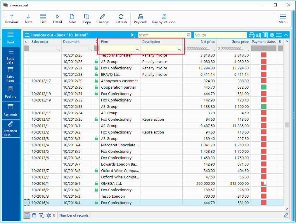
Module Toolbar
The toolbar of a module typically contains the functions most commonly used by the user in the module.

Picture: Module Toolbar
Usual Toolbar Functions:
- Previous, Next - functions for moving the light indicator in the table and browsing the records.
- List - button to display a list of records (table).
- Detail - view records detail.
- New - button for creating a new record in the table.
- Copy - a copy of the record
- Change - button for editing documents.
- Refresh - a function to refresh (recovery).
The user can add favourite and high frequency functions, e.g. from the Reports and Scripts (F9) book, to the toolbar. It is possible to edit and add functions by editing fragments only.
By means of the icon  you can display a list of the main functions related to the data module (book) which you are working with. The availability of functions in this list is also changing depending on the status of the document, i.e. if the document is in Change mode, the functions which are available in the Browse mode may not be available.
|
|
|
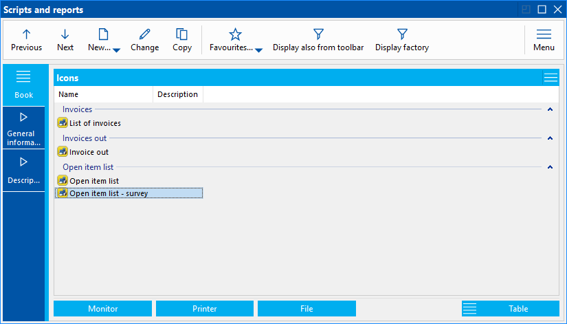
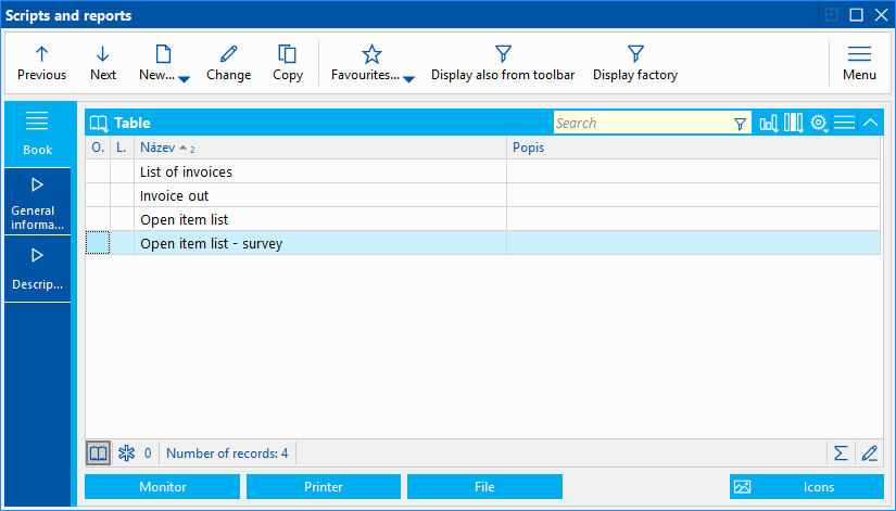
Table (Datagrid)
Table, resp. the grid is the data part of the forms. E.g. records in books or document items are displayed within a table. The similar rules as for a book in the classic grey forms valid for a table.
A table's header is a part of the table. It is a blue bar in the upper part. There is a search field for a quick searching in the book. It is possible to enter a text or a number into the search field and after pressing Enter key the record will be found. Thus, by entering the business year and a number, you can find e.g. the specific invoice in the book (table). Books in the K2 IS may contain more search fields. It is possible to switch them by pressing Alt+Z keys or by pressing the icon  and selecting the desired search field from the list.
There is the status, you are currently in, mentioned in the header of the table. Records in the books may be presented by means of 3 status - Book, Container and Filter. There is always visible an icon symbolizing the current status in the table header. Further a name of the data module (e.g. Invoices Out) and a name of a book, Container or filter are stated here. To switch between statuses use the icons at the left bottom part of the table. These icons are:
 icon to set the Book mode. It is also possible to use the Shift+F9 keys combination to set this mode.
 icon to set the Container mode. It is also possible to use the Alt+F9 keys combination to set this mode.
 an icon to set the Filter mode. Clicking on this icon shows a list of predefined filters that can be used. Further, you can find an option to add, resp. remove a filter condition, Administration of filters and Column Filter.
Some icons for easy starting other functions can be included in the header of the table (blue tape). These icons may start e.g. automatic reports or show all functions for the given grid. It is possible to insert any action related to the given datagrid into the header by using designer.
There is also an icon for menu  in the header of a table. This icon includes all the operations the user can perform with the table. These are the following operations:
- Container - the possibility of inserting the selected records in a table to a container. For this function you can also use the Ctrl+Alt+Shift+F9 keys combination.
- Editing - the basic operations, i.e. Copy or Change records in the table.
- Functions of grid - functions which can be used for the given grid, e.g. work with columns, edit rows or export to Excel.
- Filters - available options to work with filters in the table.
- Auto reports - possibilities for the automatic reports.
On each record in the table, using the right mouse button, we can display the functions that relate to the given record, a specific field (cell), or to the entire table. These are the following functions:
- Create filter - the form to create filter with a predefined condition on a value from the cell on which you are currently standing will be displayed.
- Add condition - an option for adding a filter condition. The form with a predefined condition on a value from the cell on which you are currently standing.
- Selections - this option contains available operations to mark records.
- Editing - the basic operations, i.e. Copy or Change records in the table.
- Grid Functions - this option contain the work with columns, option to cancel column on which you currently are and export to Excel.
- Auto Reports - possibilities for the automatic reports.
Records Marking
All options for a records marking are available in the bottom part of the table on the icon  . Options for a records marking:
- Mark all records - all records of the table are marked by asterisk.
- Cancel markings for all records - all asterisks are removed from the records.
- Mark record - it marks a record on which the light indicator is positioned. The Ctrl+Spacebar shortcut key may be also used for this action.
- Mark record and go to next one - it marks a record on which the light indicator is positioned and consequently shifts a light indicator to the next record. It is also possible to use the Shift+Enter keys combination for this operation.
- Add selected records to container - it adds all selected records to container.
Number of the selected records is always displayed next to the icon with asterisk in the bottom part of the table. The Selection column with the name s can be removed from the table only if there are no selected records and it is not possible to removed it permanently. After marking some records it is automatically added back.
The total number of records in the book can not be identified otherwise than by calculation. By using the Number of records button run the function for counting the records in the table. IS K2 displays the message about the total number of records. In the case of individual record items, the system can now quantify its number and this state is always displayed on the form.
At the bottom part of the screen, a help panel for function keys may appear. This panel may be displayed by using the Ctrl+F1 key combination or via the Key help option, which you can find under the Menu button in the module Toolbar.
|
|
|
Column Filter
The new user interface brings the possibility of using column filters. This makes filtering records in books easier. Turning the column filter on is via the Column Filter option, which appears when you click the icon . A new row, which serves to enter filtering conditions, is added into the table.
Picture: A table with the active column filter
For performance reasons, you can realize a initial filter condition only through the physical fields Therefore, only some filter fields are available for entering conditions when the column filter is started. After entering this condition and pressing the Enter key, the records are filtered and the filtering fields will be made available for the remaining columns in the table at the same time. So we can continue to filter and reduce the number of records according to the defined conditions.
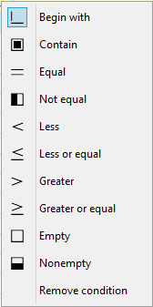
Several filter operators can be used for filtering. The list of these operators is always available when you click on the icon  , which is accessible in each field for entering filter operators.
Picture: List of Filtering Operators
The system remembers the setting of the Column Filter option even after the next start of the book.
|
|
|
Fulltext Search
In the IS K2 it is possible to use full-text search function. This method is useful if the user does not know exactly how the required information are stored in the system. Use the icon to launch the full-text search function and select the Search option in the displayed form. This function can also be activated by using Shift+Ctrl+F key combination.
After starting the function, the field named Search will appear in the table header (blue bar). This field is used to enter the text that we want to search for. After entering the text and pressing the Enter key, the records that match the entered text or are similar are searched for. These are records that contain not only the exact match with the search term, but can they can also be inflected or without diacritic.
For correct fulltext search functionality, it is necessary to set the fulltext keys by using the function No. 778 Administrator - fulltext keys settings.
|
|
|
Edit Rows
The Edit rows function enables to edit values directly in the rows. The Edit rows mode can be activated via the icon  . If this mode is activated, it is possible to edit the selected field in a table by using Enter key without having to switch the record into the Change mode. Press the Enter key again to confirm the executed change. Using the Esc key means leaving the edit field without confirming the change. Edit rows mode can be used separately for each form and the form "remembers" this settings. The edit rows mode can also be activated permanently or totally disabled on the form by using the designer.
If the Edit rows option is active, the item form can be opened by pressing the Alt+Enter keys if it is necessary. If the Edit rows mode is not activated, this combination behaves exactly the opposite, ie it activates the editing of the selected field. This process is recommended!
The standard F5 key to change the record is available in the Edit rows mode.
|
|
|
Mathematical Operations
In each table within the universal forms, mathematical operations can be used. These are Sum, Average, Minimum, Maximum and Number of Different. These operations are available in the menu after clicking the right mouse button on the selected column.
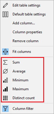
Picture: Available mathematical operations
When you start a math function, the line with the result of the operation appears at the bottom of the table. These operations can be applied to multiple columns simultaneously. Mathematical operations respect the state in which the table currently is, i.e. they can be used in Book, Filter or Container. If you indicate records with asterisk in any mode, math operations will only be used for these records. Marking is always preferred.
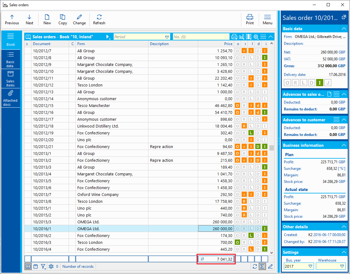
Picture: The Sales order book with aggregation (average)
If the records, from which the result has been calculated, are updated, the row with the result becomes grey. This one may be updated by pressing the icon  . The display of the aggregation results panel is remembered by IS K2. When the book is re-displayed, this panel is available again but is not counted. The calculation (update) can be executed by means of icon . In the case of items it is not necessary to perform the update.
The panel with results can be hidden by means of the icon  . Use the right mouse button on the aggregation result to display the menu where the Copy option is available, which inserts the result value into the clipboard. Math operations are part of the table settings and can be saved as a template.
|
|
|
Quick search records Alt+F7
This function is used to search for records in a table. It can be activated by Alt+F7 key combination. Then, the form to enter conditions will be displayed.
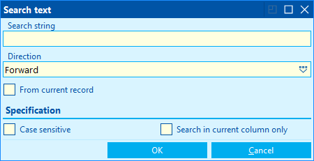
Picture: The form to quick search for records
Fields' description:
Search string |
This field is used to enter the text that we want to search for. |
Direction |
Search direction. Forward - the search function moves from top to bottom. Backward - the search function moves from bottom to top. |
From current record |
The search starts from the record on which the ruler is stated. |
Case sensitive |
The search will distinguish between uppercase and lowercase letters. |
Current column only |
The function searches for records in the current column only. |
After searching, records matching the conditions are marked. You can browse marked (searched) records by pressing Ctrl key and numeric + or - key.
|
|
|
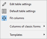
Work with Columns
Sorting and appearance of the columns can be set in the table. Options for the work with columns are stated in the table menu through the Grid Functions - Table settings. Another way to view these functions is by using the icon  , which can be placed in the table header.
Picture: Functions for the work with columns
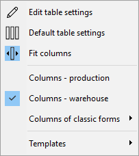
Functions for the work with columns:
- Edit table settings - this option displays a form to modify the current table columns settings. Columns from the current table view will be loaded to the form.
- Default table settings - this option resets the column settings to the default state. This state can be defined by the program or by a user.
- Fit columns - if you choose this option, the columns fit the current size of the table and spread across the entire window.
- Columns of classic forms - this function allows you to apply column templates created in classic grey forms.
- Templates - it displays options for saving the current settings as Column Templates.
|
|
|
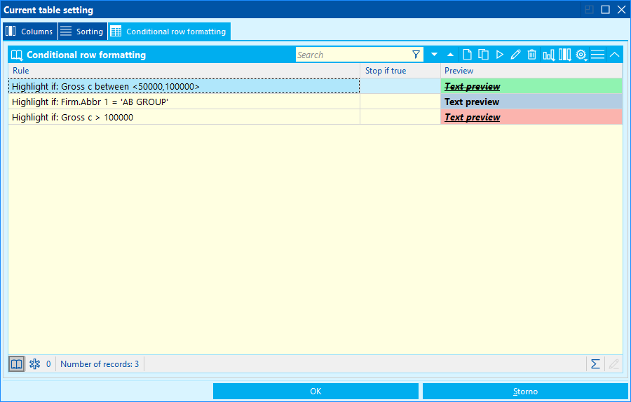
Changes in the current table column settings can be made by the option Edit table settings. The Current table settings form is displayed.
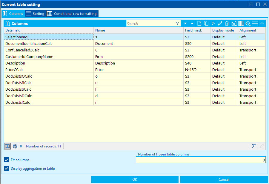
Picture: TheCurrent table setting form
Fields' description:
Fit Columns |
If this field is checked, the column width fits to the current size of the window. Otherwise, the column width is not changed. After reducing the window, the columns are gradually hidden and a scroll bar is available at the bottom of the screen. |
Number of frozen table columns |
Here determine how many columns will be frozen. These columns will always be visible, and will not go off the screen when scrolling. The entered number of columns from the beginning of the list is always frozen. |
Display aggregation in table |
It displays a panel for results calculated by aggregation. |
In the Current Table Settings form, you can edit the column settings on the Columns tab. The fields from the current table setting are always automatically loaded into this form. This fields correspond to the columns in the table. The individual columns are shown in the appropriate order, which can be changed using the arrow icons.
A new column can be added into a form for column settings by using Insert key. A list of all available field of the given data module will appear. From this list you can select a field and add it to the list of table fields (columns).
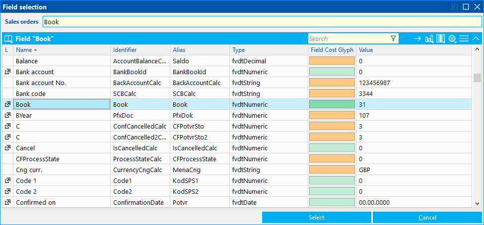
Picture: List of the data module fields
Color bitmaps for individual fields express the complexity of their calculation (evaluation). Green bitmaps are displayed for the simply evaluated fields, while red bitmaps are displayed for more time and resource-consuming fields. In this way, you can estimate how the field will affect the execution speed of the table, for example. The Value column always displays the current value of the record field in the table where the user is located.
For fields, that are marked with an icon  , a linkage to the other data modules is possible. It means, that they are further nested. To the next nested level you can get by clicking on this icon or by Ctrl+Arrow keys. The selection can be performed by the mouse double-click or by means of Select button or by Enter key.
After selecting the requested field, the form, where it is possible to change the properties of the column and define the rules for formatting, will be displayed. This form can also be displayed by double-click of the mouse on the selected column in the Table setting form or by using the Enter key.
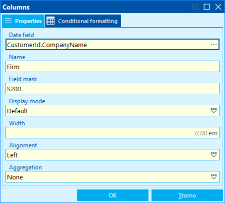
Picture: Column Properties
The requested column will be inserted into the Table Setting form into the Columns tab by confirming this form.
The form also contains the Sorting tab. Here you can set the sorting in a table. This is done by inserting a column, or columns, according to which the table will be sorted, on this tab. For each column, it is also possible to adjust the direction of the sort, ie. descending or ascending.
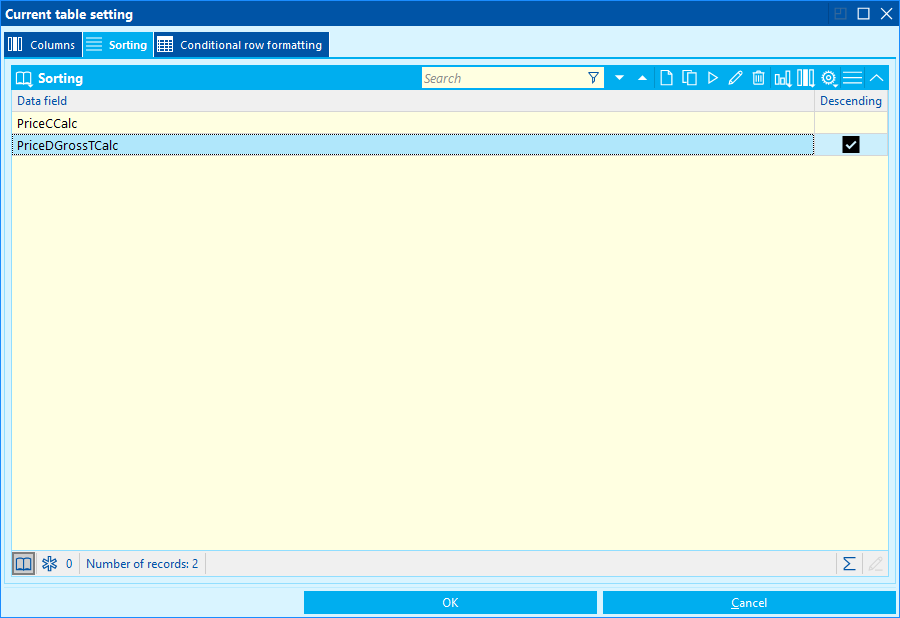
Picture: The Current table setting form - the Sorting tab
There it is possible to define conditions for formatting table rows on the Conditional row formatting tab The further description is stated in the Conditional Formatting chapter.
Use the OK button at the bottom of the form to confirm the edits. This will only change the current column settings of the given table.
The current table settings as well as other table properties (form positions, column width, expander status, etc ...) are saved within attributes and IS K2 remembers this setting. These attributes can be deleted and you can always return to the default state. To delete attributes serves the function which can be activated by pressing the Ctrl+Alt+Shift+A key combination or in the menu of functions of the data module through the Administration - Delete Form Properties options. The availability of this function is conditional on the right for service actions. The function is available in the new user interface only.
|
|
|
Within the table settings, it is possible to explicitly specify the column width in universal forms in "em" units. This unit is based on the font format, and it is always the width of the capital letter M. The main advantage of using this unit is the fact that, after entering the column width, the user will always see, in all circumstances, the same part of the text.
By default, the width of the columns in universal forms is given by the "picture" setting. Quantifying the column width in the "em" unit occurs always during the manipulation of that column. So, for example, if you change the column width with the mouse, the "em" value is automatically calculated for that column.
The column width in the "em" unit can be manually specified in the Columns form in the Width field.
Picture: Column Properties
The entered column width is also saved within column templates.
If we adjust the column width and then use the Fit columns option, the ratio between the individual columns will always be maintained.
|
|
|
The current columns setting can be saved as so called Column Templates. These are the different table column settings that we can save under the selected name. The user can then access this setting at any time.
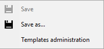
All the options for working with templates can be called up using the icon and then through the Templates option.
Picture: Options for the work with column templates
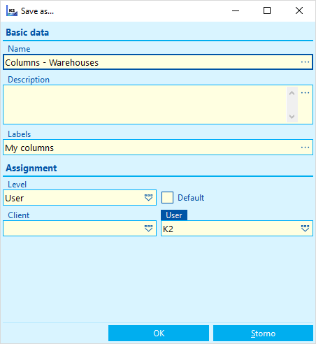
To save the current column settings as Column Templates, select Save As option. Then the form, where you can fill in some aspects of the template, will be displayed.
Picture: The form to save the table setting as a Column template
Fields' description:
Name |
Name of a column template. |
Description |
Description of a columns template. |
Labels |
The field for adding the column template into a group. A name of the given group is entered here. Within this group, the template will be included in the context menu. |
Level |
Level, for which the column template will be saved, is selected here. |
Client |
A field to select the client which will have the created column template available. |
User |
A field to select the user who will have the created column template available. |
Default |
If this field is checked, the column template is considered by the program to be the default. This template is set when using the Default columns option. |
If the system find a column template with the same name when saving, the message about overwriting will appear. The K2 IS checks not only the name but also the level of saving.
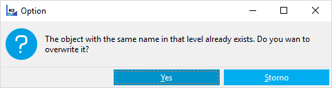
Picture: The message about overwriting the columns template
The saved column templates are available to the user in the Templates administration book and in the context menu under the Grid Functions - Table Settings option or by clicking on the icon , which can be placed in the table header.
Picture: Context menu of column templates
If some of the defined templates is applied, the icon  is displayed next to it in the context menu. If some changes will be made in the template, it is possible to re-save it by using the option Template - Save.
|
|
|
The created columns templates are saved into the Templates administration book. This book is not just a record of all templates but it is also possible to create new templates here. The book for Templates administration is displayed via the Templates - Templates administration option.
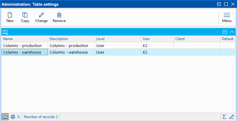
Picture: The book for Templates administration
A new template may be created by Insert key. The Table Settings form appears. Here, the columns and other settings for the table are defined.
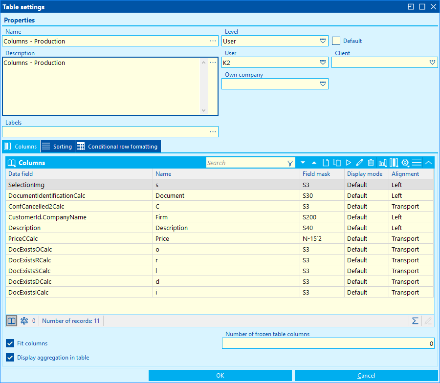
Picture: The Table settings form
Fields' description:
Name |
Name of a columns template. |
Description |
Description of a columns template. |
Level |
Level, for which the column template will be saved, is selected here. |
User |
A field to select the user who will have the created column template available. |
Client |
A field to select the client which will have the created column template available. |
Default |
If this field is checked, the column template is considered by the program to be the default. This template is set when using the Default columns option. |
Labels |
The field for adding the column template into a group. A name of the given group is entered here. Within this group, the template will be included in the context menu. |
Fit Columns |
If this field is checked, the column width fits to the current size of the window. Otherwise, the column width is not changed. After reducing the window, the columns are gradually hidden and a scroll bar is available at the bottom of the screen. |
Display aggregation in table |
It displays a panel for the results of calculated aggregation. |
Number of frozen table columns |
Here determine how many columns will be frozen. These columns will always be visible, and will not go off the screen when scrolling. The entered number of columns from the beginning of the list is always frozen. |
In the Table Settings form on the Columns tab, enter the columns in which the data will be displayed in the table. A new column can be added here by Ins key. Columns are always selected from the list of the fields of the given data module. The procedure is the same as in the case of editing the current table setting. The Sorting tab is used to set the columns by which the data in the table will be sorted and the Conditional Row Formatting tab serves to define the conditions for formatting the table rows. The further description is stated in the Conditional Formatting chapter. Use the OK button to save the created template of columns.
|
|
|
You can work with the columns of a table directly in the IS K2 desktop. By using the right mouse button, it is possible to display the context menu and via the option Grid functions open the menu of options to edit table columns.
Available options:
- Edit table settings - this option displays the form to edit the current table column settings. Columns from the current table view will be loaded to the form.
- Add column - a list of all available fields of the selected data module, from which you can choose the requested field and insert it like a column into a table, will be displayed.
- Remove column - it removes a column from the table.
- Column properties - it displays the form to edit properties of the selected column.
Columns within the area IS K2 can be moved using the mouse to change their order. It is also possible to remove columns by dragging them.
|
|
|
It is possible to use Views when working with columns in universal forms. Within the views, you can save setting of all the tables of the entire form (book) all at once, and then apply this setting. All options for the work with column views will be displayed via the module menu, Views - Administration.
Functions for the work with view:
- Default columns - this option restore the default columns setting of the all tables of the form.
- Save current view - it displays the form to save the current table settings within the view.
- Administration of saved views - it displays a table with the list of all created views.
If we make any adjustments to the columns setting of the form tables, we can save this setting as a View. This is done via the Views - Administration - Save current view option. The form to save a view will be displayed.
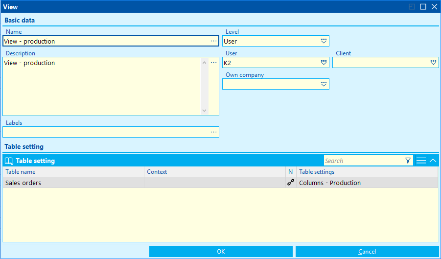
Picture: The form to save a view
Fields' description:
Name |
Name of a view |
Description |
Description of a view |
Level |
In this field, select the level which the view will be saved for. |
Client |
A field to select a client whom the saved view will be available for |
User |
A field to select user whom the saved view will be available for. |
Labels |
The field for adding the view into a group. A name of the given group is entered here. Within this group, the view will be included in the context menu. |
There is Table setting in the bottom part of the form for saving view. Here, the changes made by the user are always loaded. This is a list of tables where the column settings has been changed. The Context column contains a name of the data module (table) where the change has been made. If the Context field is empty, it is a list of records (the List tab). If a column setting is created and saved as a Column Definition in any table of the form, it will be added to the Table Setting field. This setting has to be applied in the given table and it must not be changed, then it will be loaded into the form for saving view. Save a view by using OK button.
The table setting can also be entered manually here. Show the Table setting form by using Insert key in the field for table setting.
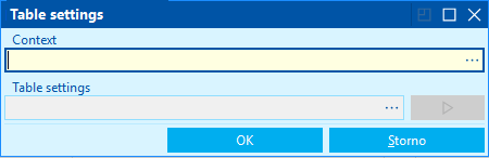
Picture: The Table setting form
In the Context field, a name of data module is entered. The field can be expanded and it is possible to select from the list of data modules. Enter the created Column template into the Table setting field. This field can also be expanded and then you can select one of the created definitions for the given table from the list. By means of the button  you can display the detail of a table setting.
The saved views are available in the Administration of saved views book. You can open this book via the option Views - Administration - Administration of saved views.
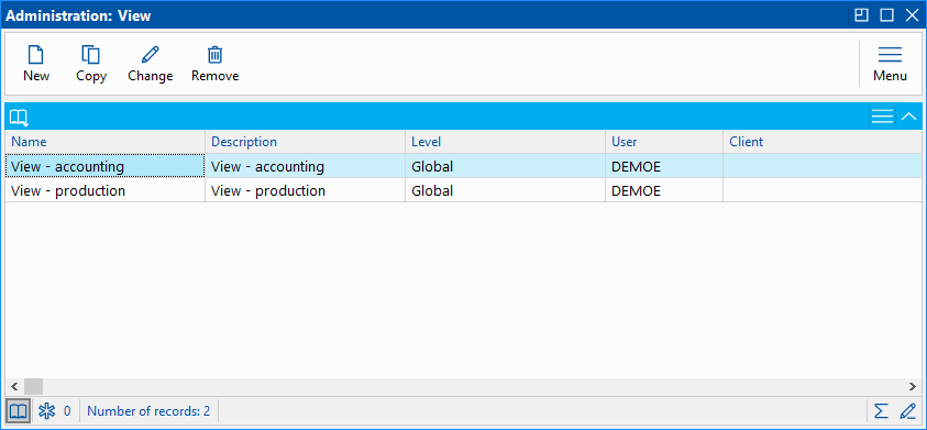
Picture: Administration of saved views
In this book, you can work with the views. It is also possible to create new views by using Insert key. In this case it is necessary to enter everything manually. When creating views, we recommend the procedure when the current table settings is loaded into the form.
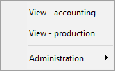
The saved views are also available to the user directly in the context menu through the Views option.
Picture: Views Context Menu
If we add an icon to open a book on the IS K2 desktop, we can set the view in which the function will start. This is done in the form in the View field. Views to the given data module are loaded into this field.
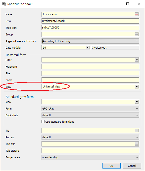
Picture: Setting the view in the form for a button on the IS K2 desktop
|
|
|
By means of this function, you can define rules for formatting rows or cells in a table.
Picture: A table with applied conditional formatting
|
|
|
It is possible to set the format for each table row according to the entered condition. This is done in the form for a table settings on the Conditional rows formatting tab. Here we define individual formatting conditions.
A new condition can be entered here by Insert key and then by selecting the Formatting based on conditions option. The form to define conditions of formatting will be displayed.
Picture: The form to define conditions of formatting
Fields' description:
Condition |
Press this button to display the filter conditions editor. In this form you can enter the appropriate condition for formatting. Here we proceed in the same manner as in the case of filters in K2 IS. There are two types of conditions: Comparison and Nested condition. |
Stop if true |
If this flag is checked, the function applies all the specified conditions upto this one. Other formatting conditions are no longer taken into account by the function. |
Format |
In this section there are several checkboxes for setting the row format. The font format can be set to Bold, Italic, Underlined, Crossed Out. |
Colours |
The field to select a formatting colour. The colour palette in this field is always based on the currently set visual style. Furthermore, the Own option is available here. When you select it, the background and foreground colour selection fields become available. |
Background colour |
The field for selecting a background colour for cells. Here, you can select from the colour palette. |
Colour of foreground |
The field for selecting a colour of foreground for cells (font). Here, you can select from the colour palette. |
Pressing the OK button will insert the condition into the list.
Picture: The created conditions of formatting
If conditions with the same rule are entered, the last entered condition takes precedence.
The created formatting conditions are saved in attributes (current table settings) or can be saved within column templates.
|
|
|
Like rows in a table, we can also format columns. The conditions for the column formatting are specified in the form for column properties setting on the Conditional Formatting tab.
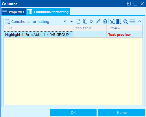
Picture: Conditional columns formatting
A new condition can be entered here by Insert key and then by selecting the Formatting based on conditions option. The form to define conditions of formatting will be displayed. The procedure for entering conditions of column formatting is the same as for rows. The entered conditions are then valid for the cells of the given column only.
|
|
|
Formatting rules can be applied in an accelerated manner directly in the table. You can use the right mouse button to display the context menu and via the Highlight Records option call up the menu that always contains Lines bigger/smaller than and Cells bigger/smaller than options. If you choose one of the options, the form for the detailed specification of condition will be displayed.
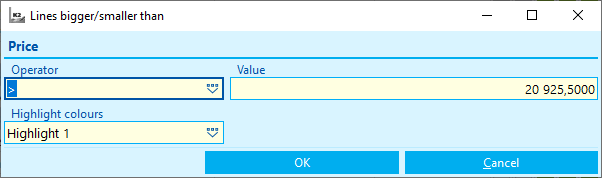
Picture: The form for entering conditions
Fields' description:
Operator |
The field for selecting a comparison operator of the condition. |
Value |
A value for the condition. |
Highlight colours |
The field to select a formatting colour. The colour palette in this field is always based on the currently set visual style. |
After pressing OK button, the entered formatting condition will be added to the row or column settings.
|
|
|
Charts
In the new user interface, it is possible to define graphical processing with charts for the evaluation. Charts are defined and run only in a container or filter state or on the marked records. You can run or define a new chart by using the icon  or via the option in Menu for grid.
Definition of a new chart:
When defining a new chart, some fields are pre-defined automatically. A field, according to which the table (grid) is sorted, is automatically inserted into the 'Grouping field' field and an active field of the row on which a cursor is placed when running a chart, is filled into the 'Field with value' field. These values can be edited and you can work with them similarly as in the other components, e.g. selection of columns. In addition, the user selects the type of chart, sorting and filter.
There is the option Save as in the left bottom corner under the Other possibilities button. The final chart definition can be saved via this option.
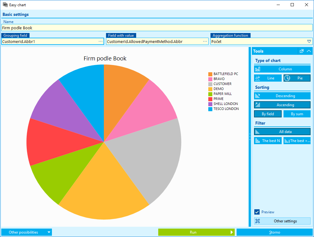
Picture: Definition of a new chart
Fields' description:
Name |
Name of a chart definition. |
Grouping field |
A field, according to which the rows are defined in a chart. |
Field with value |
Measured value |
Aggregation function |
A function which will be used for the field with a value. |
Type of chart |
Here you can select the type of a chart. Available options are: column, line or pie chart. |
Sorting |
Sorting values in ascending or descending order. |
Filter |
Choice whether to display all values in the chart, the first ten by sorting or the first 10 by sorting plus the rest of the values. |
Preview |
It displays a full chart or a preview only (useful when creating a chart above large data). |
Other setting |
Other setting |
|
|
|
Tabs
Tabs, resp. pages of the document are placed in a vertical direction in universal forms. Tabs serve to switch document pages and they are always defined by an icon and a description. A description informs the user about the character of the fields, which are placed in the selected tab.
It is possible to use the left mouse button for switching among the tabs (pages). Clicking on the tab will always display it. You can also browse individual tabs by using Alt+right (left) arrow key combination. The Ctrl+Tab key combination switches the tabs inside the form which is currently displayed.
|
|
|
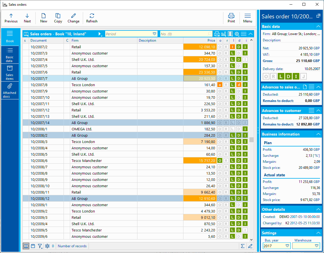
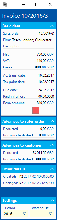
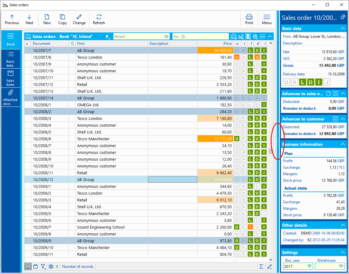
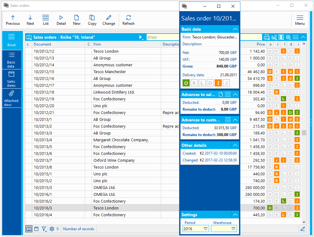
Record Preview
When you open a book in universal forms, a panel for a quick record preview, so called Preview, may be on the right side of the screen.
Picture: View of table record (invoice)
In the Quick Preview panel, you can always see the basic information of the record on which the light indicator is currently set. When browsing table (book) records, the data stated in this panel are always updated. To obtain the most important information about the current document, it is no longer necessary to display other pages (tabs) of the document.
The Settings section is an important part of preview, the most important settings for the given table are available here. Here, you can set e.g. the requested period or warehouse. The displayed data in the table (e.g. stock information) can related to this setting.
In the record preview, you can also find e.g. a map, evaluation of subjects in registers, electronic addresses or social networks.
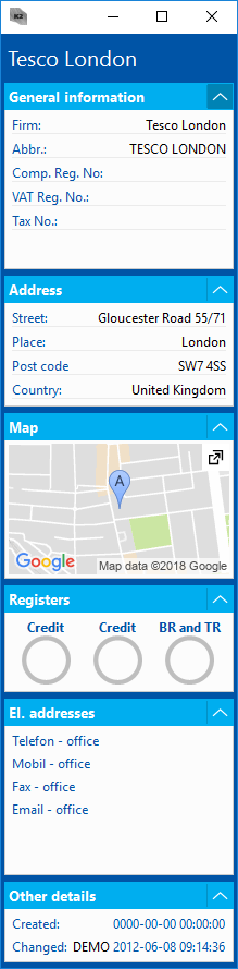
Picture: View of table record (Suppl./Cust.)
The icons placed in the preview can be active, by clicking on the icon, we can display the subject profile on the social network or we can check it in the appropriate registry.
The size of the Quick View panel can be changed using a Splitter, or you can hide it completely by clicking on this splitter to get the maximum space for a table.
|
|
|
Components of the Form
From the list to another document tab (page), we can switch e.g. with the left mouse button. Standard data modules contain two or more pages, basic data are usually on the 1st page and items, event. attached documents and ext. documents are stated on the other pages.
Each page may then contain additional tabs or components that differ in the type and nature of the entered information.
Picture: Form - universal
- Search menu (lookup) - after clicking on the icon, the user sees a list of values that can be filled in that field.
- Editing field (edit) - a field into which you can type the value of a predefined type (text, number, etc.).
- Checkbox - a field defining a value YES / NO.
- Expanding panel (expander) - it groups the components that can be hidden or displayed.
- Tab - every page can contain other tabs where the next components can be placed.
- Date field - a field into which it is possible to enter only a date by selecting from a calendar or by simplified entering.
- Button - actions can be run, a floater may appear or other fields may be displayed or hidden after pressing a button.
- Preview - summary information about the current record.
|
|
|
Basic Components of the Form
These components of Universal forms define their basic structure and determine their appearance by grouping other individual fields, information and components. These are Drop-down list (Expander), GroupBox and Flowter.
|
|
|
Drop-down panel (Expander)
Drop-down panel (Expander) is a component grouping fields that are related.
Picture: Drop-down panel (Expander)
Drop-down panel is always defined by a title that specifies the context of the fields that are contained there. Expander can be packed, and so it is possible to reserve more space on the form for the information we are interested in. Pack it by using the icon  , which is located in the upper-right corner of a panel. The system remembers this state (collapse) of a panel for the user.
|
|
|
GroupBox
Another component of the universal forms associating field is GroupBox.

Picture: GroupBox
This component contains the title and the line that separates it from the rest of the form. Use this component to separate field blocks on the form for greater readability to the user.
|
|
|
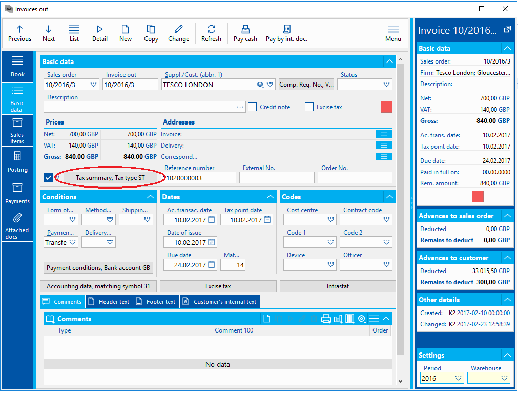
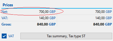
Floating Form (Floater)
The Universal Forms component, which also groups information blocks and fields, is so called the Floating Form or Floater. Floater is always displayed by using the button and is part of the form. It does not include buttons such as OK or Cancel. A specific value can be displayed into the name of a floating form button, e.g. a button for tax summary may contain the name of a specific type of tax.
Picture: Example of a button to display Floater
Pressing the button uncovers the form where the other fields are located. These are generally less important fields that do not need to be placed in the main form.
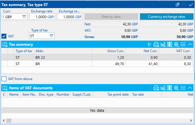
Picture: Floater for a Tax summary
This form can serve not only as a preview of values, but it is also possible to edit the field here. The floating form is always updated when browsing the individual record in the book, e.g. by using + and - keys, due to the record we are standing on. Floater always remembers the position on the screen where the user has placed it, and also its size. You can return it to its default location and size by using the icon  . You can close the floating form by using the icon , clicking outside the form or by using Esc key.
|
|
|
Treeview
TreeView is a component, which serves to display records in a tree structure.
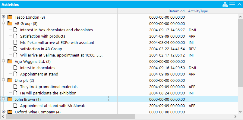
Picture: Treeview of Activities
Entries in TreeView can be displayed as a tree structure or as a table. Display mode can be selected in the list of options which is displayed by using the icon  . All the options, according to which we can sort the records in the tree table, are always available in this list. There is also the option No grouping. By using this option, we can display records without any sorting as a table.
Using a designer, treeview can be defined so that only a tree without any other columns is visible to the user.
It is possible to edit a TreeView by using a mouse by 'Drag and Drop' method. By using the mouse, we can grab any record and transfer it to the requested treeview level. Records, where a level has been changed, are marked by the icon with a pen (it does not valid for standalone items).
|
|
|
Tabs in Forms
The tabs are a component which serves to switch a contents. The tabs can serve not only as the main component determining the pages of records in individual books, but also as an organizational component in the form. Tabs are defined by an icon and title, which informs the user of the character of the fields and information located here. It is possible to place any arbitrary components on tabs.
Picture: Example of using tabs in the form
|
|
|
ListView
The ListView component serves to display a list of records. The advantage of this component is the dual display capability.
- Display with icons - records in a table can be displayed in the style with icons. This style is activate by using the Icons button.
Picture: Display with icons
- Display in a table - records are displayed as a table. This style is activated by using the Table button.
Picture: Display as a table
|
|
|
Splitter
The Splitter component serves for horizontal or vertical division of the screen area. The fact, that Splitter is placed on the form and that it can be used, you can recognize by the symbol with dots.
Picture: The Form with Splitter component
The system keeps location of this splitter in mind and you can control and move it by using the mouse. It is also possible to close the window by double-click of the mouse on splitter.
|
|
|
Data Components of the Form
These are universal forms components that show us the specific information from the system, and through which we can enter information into the system.
|
|
|
Text, numeric, and checkboxes
The text field is a component which enables to save any information in text format. A typical example of such fields is the Description field.
Into a numeric field a numeric value can be enter only. Any other text value this field does not accept. An example of such a field is e.g. Maturity.
The CheckBox is used to set the Yes / No fields. It is e.g. the VAT field in an invoice. The tick can be done with the left mouse button.
|
|
|
Label
Label is a form component that is usually in the form of Name + Value + Additional Text.
Picture: Data component of the type Label.
The Label component is widely used within the record preview (Preview).
|
|
|
Date Fields
To a data component, you can enter values by choosing from a calendar, which is displayed by the icon  or by F12 key.
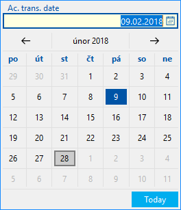
Picture: Calendar for date selection
For the data fields the user can use the accelerated functions to enter the values:
- You can enter the specific day of the current month by filling in only the day in the date field, the system will automatically fill in the current month and year (after confirmation with the Enter key).
- You can enter the day and month of the current year by filling in only the day and month. The current year will be completed by the system by pressing the Enter key.
- You can enter the current (today) date by adding only a dot in the field. After pressing the Enter key, the system completes the date.
The dot generally replaces the current day, month, or year in the date fields and can be used when entering the date. When entering the value, e.g. '. . 2015' the system completes the current day, the current month and the year 2015.
|
|
|
Selection menu (Lookup)
When entering values into the field of the lookup type, the user can choose, within universal forms, the type of a form for selecting a value. The choice of value selection can be displayed in lookup by using the right mouse button via the Search option.
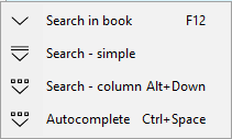
Picture: Choice of value selection
In the form, the user has several options for entering the values of the selection menu:
- Search in book - this option displays a book in which you can search for the requested record. It can be executed also by F12 key. If the window is open in the state Search in book, the work in the K2 IS is not blocked or limited. The user can work in the next opened book and tabs. In the original gray UI that was not possible.
- Search - Simple - option for so-called simplified selection. A simple list, not a book, where records are usually listed in only two columns, is displayed.
- Search - column Alt + Down - the option to search for a record in the column list. This is a simple list with multiple columns.
- Autocomplete - so called Autocomplete function can be enabled by this option. The principle of the autocomplete function is that when you enter a value or an incomplete value into the field and press the Ctrl+Spacebar key combination, all the records (book) are not loaded, but they are filtered out. A limited list of values, that correspond to the entered text, is displayed. In this case full-text search of records works.
The system remembers the last selected search method in the given field and automatically offers it after pressing the icon in the right part of the field as a quick option. It is always an icon which corresponds to the selected option for selecting values in the form, see the Choice of value selection picture.
|
|
|
Form Components Options
Using the right mouse button on the form component (field), you can see all available options that you can use when working with the component.
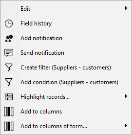
Picture: Options of Form Field
Description of the options:
- Editing - there are basic operations available under this option.
- Copy Ctrl+C
- Paste Ctrl+V
- Cut Ctrl+X
- Select all Ctrl+A
- Field history - the form with history of the field is displayed.
- Search - this menu contains options for searching values in the code lists. These functions are further described in the Selection menu (Lookup) chapter.
- Create filter - by using this option it is possible to display the filter comparison condition form with the pre-filled values according to the selected field, and then create the filter.
- Add condition - this option allows you to add a condition to the current filter. This option displays the Comparison condition form with a pre-defined value according to the selected field.
- Add to columns - this functions adds the selected field to the columns on the List tab.
- Add to columns of form - this option allows you to select the form in which you want to paste the requested column. If we open one of the code lists in the current form, it is possible to add fields from this code list to the current form. In Sales orders, there it is possible to open e.g. the Suppliers/Customers code list. By using this option, it is possible to add the individual fields from the Suppliers/Customers module into the columns in Sales order.
There can also be the choice for selecting the field properties, which should be displayed on the form. For example, if there is the Customer field in the form, you can choose between displaying its name, abbreviation or e.g. number.
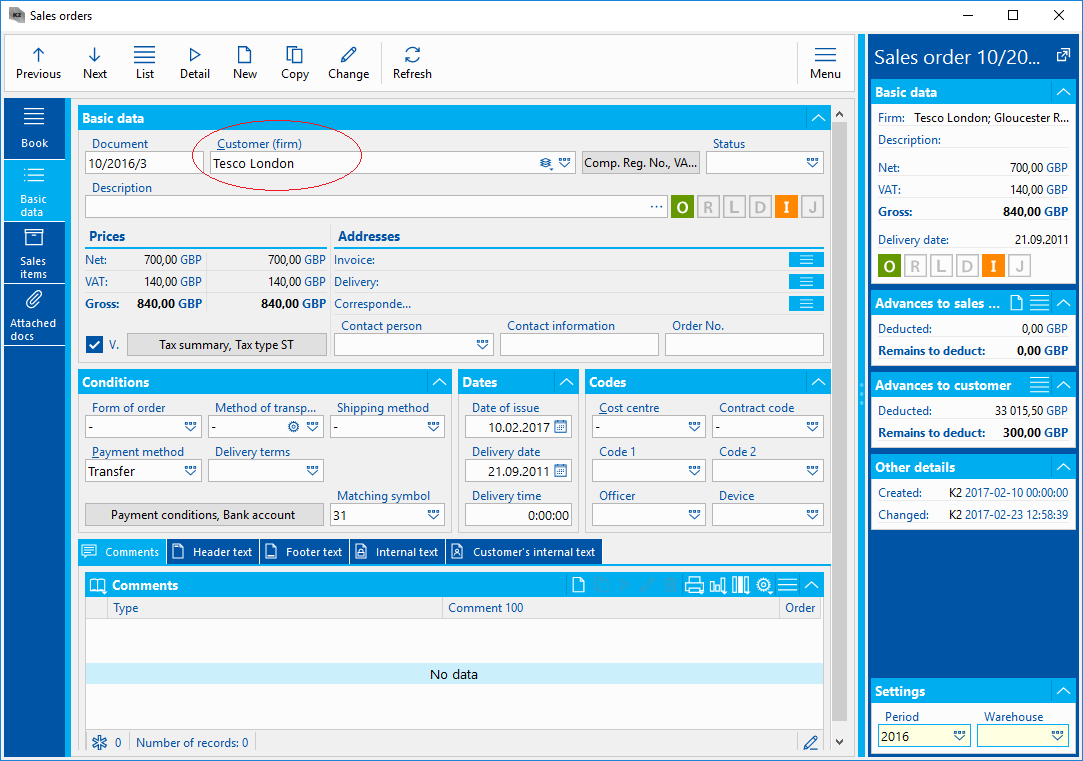
Picture: The Customer field with Firm display mode
For some fields, such as electronic addresses, you can change the display type in the options menu. Electronic addresses may be displayed as Simplified entering or List of all entered. This display may also be changed by the icon  .
.
|
|
|
Map and Picture
Entries, that include an address, can contain a map field in the universal form.
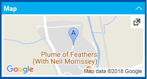
Picture: The Map in IS K2 Universal Forms
The map can display e.g. a registered office of a company according to the entered address and can be placed in a preview of the record, so-called preview. By pressing the icon  , you can display the given address in the browser within Google Maps, and then simply use it, e.g. to navigate to that position. In order for the map to correctly display the location by address, the company must have generated an Api Key to use Google Maps within its Google account. This Api Key has to be set in Client parameters on 4th page in Properties section.
Like a map, a picture or a document can also be displayed in universal forms. It is possible by using FilePreview component. This component is usually included in the Records preview or on the Attachments tab.
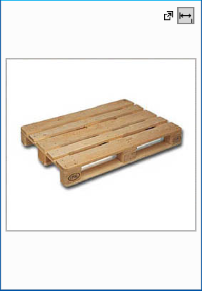
Picture: Example of a picture in the universal forms
By means of the icon which is placed in the upper right part, the picture can be displayed in the installed photo viewer. The icon  serves to zoom in, event. zoom out picture within the form.
Like the pictures also ext. documents are displayed by FilePreview component. Then the Attached docs tab in universal forms may be defined so that there will be always displayed preview of the content of the current file on which the light indicator is positioned.
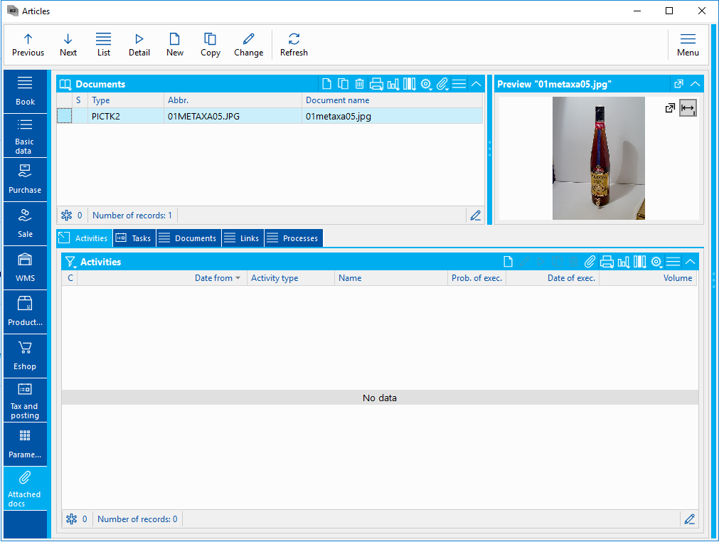
Picture: Picture preview on the Attachments tab
|
|
|
Detaching the forms
Some Universal Forms components can be detach and then it is possible to work with them as with the separate forms. The components, that can be disconnected, include e.g. Record Preview (Preview), Tabs or Floating Form (Floater). To disconnect from the form, use the icon  . Thus, if the component contains this icon, you can disconnect it. A component will be disconnected after pressing this icon.
Picture: The form with the disconnected records preview
A disconnected component behaves as a standard form and it is possible to work with it like with a standard form. It is possible e.g. to drag it to the second monitor. The system remembers detaching and placing a component, i.e. when closing and reopening a book, the component will not attach and return to its original state, but it stays detached and on the selected position (e.g. on the second monitor). When browsing, the data stated in the disconnected panel are always updated. It is possible to attach the component to the original place by closing the detached component by using the icon  .
.
It is also possible to detach any tab within the universal forms. It can be done by using the right mouse button through the Detach control option. You can disconnect not only tabs as pages of the form, but also tabs on the form, such as Comments.
The next detachable component can be Floating panel (Floater). An open Floating panel can be placed anywhere on the screen. But with the icon , we can also disconnect this panel, place it outside of the screen and use it as any other disconnected components.
By using a form designer, we can set almost every component as detachable or we can disable this feature.
|
|
|
History of the Fields
Some fields in IS K2 may be versioned. This means that the history of the field is always recorded at a certain date. There are two types of the fields with history in the IS K2.
The first type are fields that contain the icon  . Clicking on this icon displays the Field History form, where all records from this field are stored. You can also show this form by using the right mouse button on a specific field and then via the History option.
These fields allow you to set the validity of records stored in history. Only the date, not the time, is stored. Always only one record can exist to one date. The name of a user, who has changed the record, is also edited with the change of a date. The entries are sorted chronologically and it is possible to delete them by pressing F8 key. Only the user who has the Change time-valid data right can edit or delete the field. This functionality is used for fields that have a legislative meaning (e.g. change of company name, change of Comp. Reg. No in the Suppl./Cust. card or Change VAT rate in the Articles card). They always take effect to the decisive date, which differs from the date we enter it into the K2 system.
Second, there are fields only with an overview of the history of changes. The date including time is recorded. The user can not change the date and time in history. If the user performs another overwrite of the field within 9s, the changes may not be recorded. There is no icon to display an overview of the history for such fields. The Field history form can be displayed only by using the right mouse button and then via the History option.
|
|
|
Information about Form
For each universal form it is possible to show its details. Press Shift+Ctrl+Alt+F12 key combination to display the window containing basic form information.
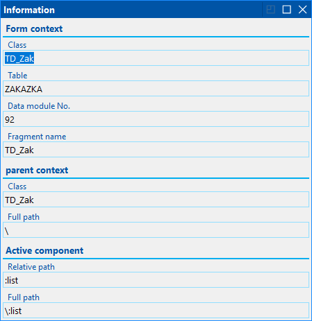
Picture: Information about the form
The form contains 3 sections:
- Form context - here is information about the data context of the entire form. Then there is the name of the table, the data module number and the name of the fragment.
- Parent context - a parent context of an active component. There is a Class and the Full Path.
- Active component - Relative path and Full path of the component on which focus is placed.
|
|
|
Transfer of Configuration Objects
Within the universal forms you can copy configuration objects (eg. templates, views or formatting rows and columns). For this purpose, the functions Shift+Ctrl+C to load the object into the clipboard and Shift+Ctrl+V to insert the object from the clipboard are available in the K2 IS. Objects can also be transferred between individual K2 IS in this way.
Functions for the configuration objects transfer are always available in the book where the objects are saved. For example, this is the Templates administration or Views administrator book.
To load the configuration objects press Shift+Ctrl+C key combination on the given object (item) or click the right-mouse button and select Edit - Copy Record. The object (item) that is marked with a blue ruler is always loaded.
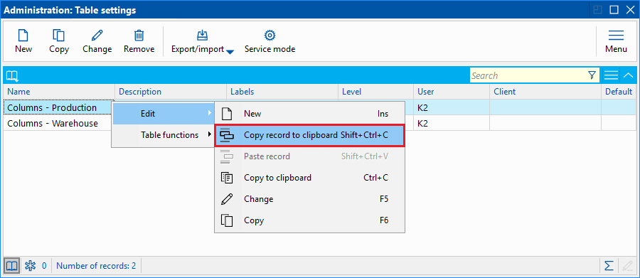
Picture: Loading a configuration object into the clipboard
To insert a configuration object from the clipboard press the Shift+Ctrl+V key combination or select the option Edit - Insert Record. By this way you can transfer configuration objects with their complete settings.
Before inserting the object, the form where you can make adjustments of the setting will be displayed and the configuration object is saved only after confirming this form.
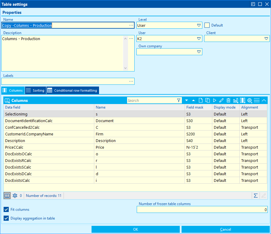
Picture: The form before inserting configuration object from the clipboard
|
|
|
Export Configuration Objects into "*.XML" file
Configuration objects can also be exported to a "*.XML" file and then imported from this file. To export the configuration object to XML, use the Export / Import button and then select the Save to File option.
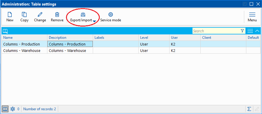
Picture: Export Configuration Object into "*.XML" file
The dialog box, where a name and location of *.XML file are defined, is displayed.
To import the configuration object from "*.XML" file, use also the Export / Import button and then select the New from File option. The dialog box for selecting the appropriate file will be displayed. Before inserting the object, the form where you can make adjustments of the setting will be displayed and the configuration object is saved only after confirming this form.
By this way you can transfer configuration objects with their complete settings.
|
|
|
Service Mode
The Service mode function is available to the user within the configuration objects. This function can be activated by Service Mode button which is available in the books of configuration objects.
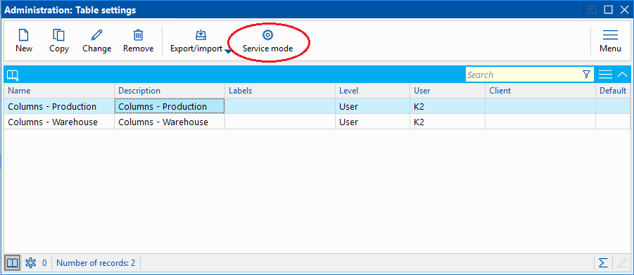
Picture: Service Mode
After running this function, the user can see all configuration objects also from the other users and can work with them. Service Mode is conditional on the right for service actions.